

Lysløypa: From Book to App
Lysløypa began as a physical guidebook to Oslo’s hidden gems. We transformed it into a user-friendly mobile app, adding exclusive discounts and a seamless digital experience for exploring the city.
Role: Research Lead & UX/UI Designer
Timeline: 5 weeks, April-May 2024
Team: Veronika Haugland
My key contributions:
Defined project scope and research strategy
Led interviews and synthesized user insights.
Shaped visual direction to align with brand tone

Why we tranformed Lysløypa
Lysløypa began as a popular booklet guiding people to hidden gems in Oslo. While well-loved, the format didn’t match today’s habits—most people explore the city through their phones. We saw an opportunity to modernize the experience by creating a mobile app, making offers more accessible, convenient, and aligned with a mobile-first lifestyle.
The Problem
Users wanted to support local businesses and take advantage of exclusive offers, but the booklet often became a barrier. If they forgot it at home or found it inconvenient to carry, both they and the businesses lost out on opportunities.
Business & Design Goals
Make offers easy to discover and redeem in a digital format
Reach beyond the limitations of a physical book
Improve the overall experience by reducing friction in daily use
Combine print and digital to maintain the brand’s identity


Research
Understanding Users & Businesses
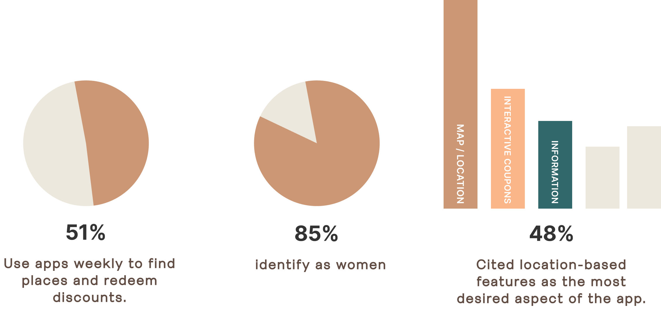
To ground our design decisions, we combined quantitative and qualitative research. A survey with 69 respondents gave us a broad picture of user habits, while 10 in-depth interviews with parents and local business owners revealed daily frustrations and unmet needs.
One recurring theme was convenience: “I love the book but wish for a quicker way to find offers that match my preferences on the go.” Insights like this helped us define essential features and shape a smoother, more personalized app experience.

Making Sense of the Research
After gathering data, we synthesized survey and interview findings through affinity mapping, which revealed recurring needs and frustrations. From these patterns we created clear personas and need statements — concrete references that shaped every design decision.
To translate insights into structure, we defined the app’s information architecture and sketched early concepts. This allowed us to explore key user flows, content hierarchy, and layout ideas, ensuring navigation felt intuitive and directly aligned with user priorities.

Turning Insights Into Design
Rooted in user research, we crafted a concept centered on quick discovery, local relevance, and ease of use on the go. Every design decision was driven by real user needs:
Looking for quick discovery? We made the map view the home screen, complemented by intuitive filters and a clear color-coded system for effortless exploration.
Frustrated by a clunky format? We shifted to a mobile-first design that stays true to Lysløypa’s brand.
Want to save offers? We added favorites and personalized suggestions for a tailored experience.

Validating & Iterating
We tested a mid-fi prototype with seven users, focusing on redeeming offers and navigating the map. Usability sessions revealed friction points like unclear labels, hard-to-scan text, and missing feedback. Iterations added clearer navigation, subtle microinteractions, and improved typography.
Users described the app as intuitive and visually engaging, confirming our updates addressed real user needs.

Reflections & Next Steps
Looking ahead, we see opportunities to make the app even more engaging: adding a flip animation and bookmark iconto preserve the “book feel,” introducing onboarding with language and personalization, and sending smart notifications tailored to user preferences and visits.
Personally, I grew from leading the research process all the way to design decisions, learning to balance user needs with brand identity and to translate insights into actionable, user-focused features.

Client perspective
“Together with Veronika Haugland, Sandlund designed an app that complements the Lysløypa booklet and has potential to scale. They led everything from research to design and testing, with strong user focus and visual alignment to our brand. The result is user-friendly, on-brand, and thoughtfully executed. It’s been a pleasure to work with them — I’d gladly do it again.”
— Christina Skreiberg, Owner of Lysløypa