

Web design for Siljevagli.no
Siljevagli.no is a digital platform for Norwegian psychologist Silje Vagli — a space where new clients can learn about her approach and easily book sessions. The focus was on creating a warm, modern, and trustworthy experience that reflects the values of her practice..
Role: UX/UI Designer
Timeline: July - August 2025

Project Overview
The goal of this project was to create a calm, welcoming, and trustworthy online presence for psychologist Silje Vagli — one that reflects her values and makes potential clients feel safe from the very first interaction. Unlike many other industries, this wasn’t about selling a product, but about designing an environment where visitors feel seen, informed, and confident enough to reach out for help.
The result needed to be clear and professional, without ever feeling cold or clinical — a digital space that translates Silje’s therapeutic approach into a modern, intuitive experience.
Process
Research & Understanding
I began by reviewing existing psychologist websites to identify patterns, strengths, and gaps. The key insight was the importance of clarity and emotional tone: less clutter, more reassurance.
Also a lot of the design needed to be in the tone of voice, how to convey trust and emotional support by wording

Moodboard capturing calm, trust, and professionalism — translating psychological safety into visual form.
Structure & Concept
From these insights, I developed a simple information architecture with a clear homepage and a small number of subpages. I also created moodboards to define the right atmosphere—balancing professionalism with warmth.

A clear site structure ensuring visitors can easily find essential information like services, contact, and background.

From wireframes to prototypes: building an intuitive flow where design supports both trust and ease of use.
Design & Iteration
Using Squarespace as the platform, I built the first version and collaborated closely with the client to refine text, imagery, and layout. Iterations focused on readability, accessibility, and ensuring the site felt both personal and credible.

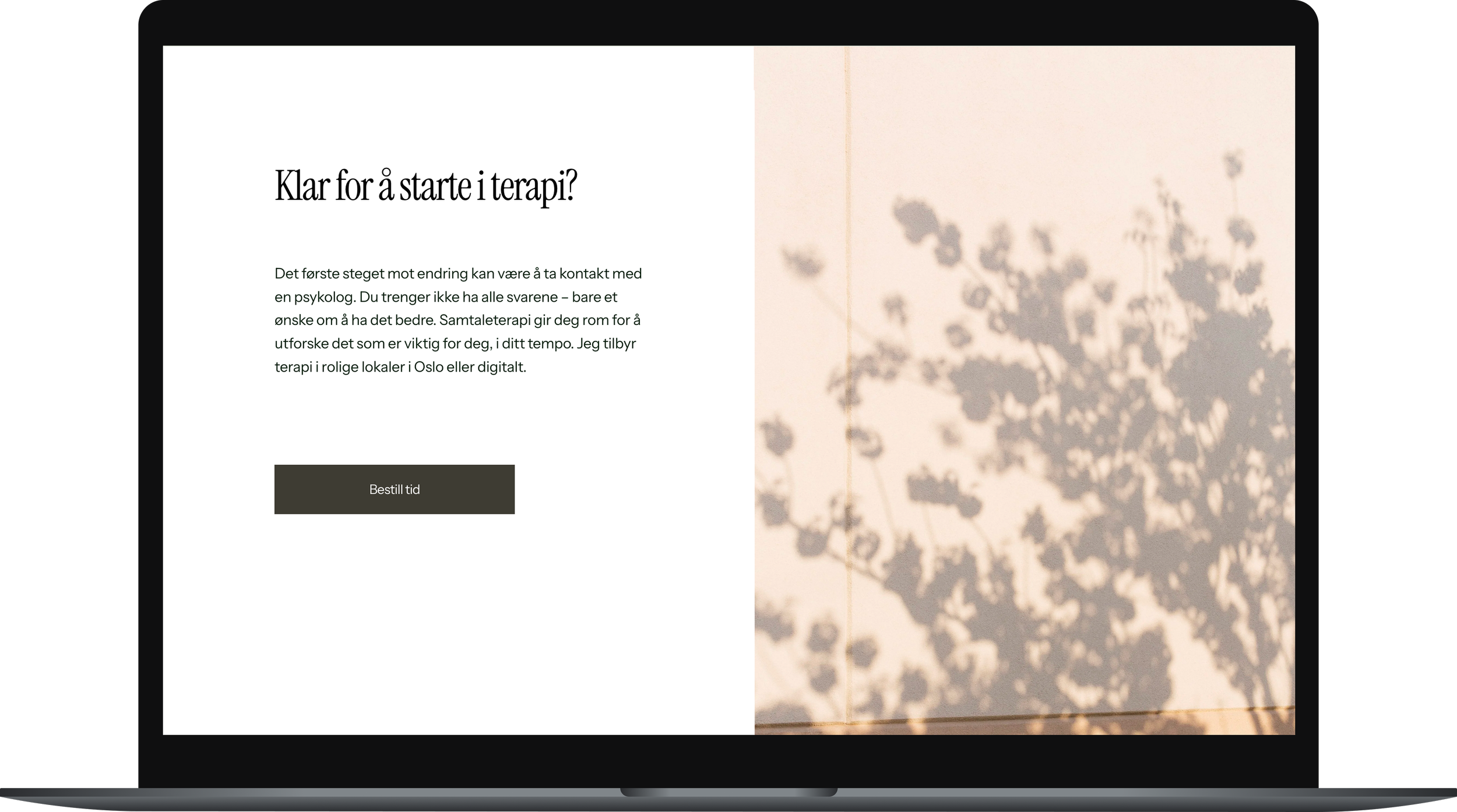
The final design balances professionalism with warmth, combining clean layouts, soft visuals, and clear calls to action.
Refinement & Launch
Finally, I fine-tuned the visual details, added basic SEO for visibility, optimized the site for mobile, and prepared for launch. To make the handover seamless, I created a short guide enabling the client to update the site independently moving forward.
Reflections
This project reinforced the importance of simplicity and empathy in design. I learned which elements — layout, typography, imagery, and content — are essential for building trust, and how a restrained, intentional approach strengthens credibility. Integrating basic SEO also highlighted how visibility and usability go hand in hand. Next time, I would invest more in content workshops, since the right words are just as crucial as visuals in shaping the user experience.

Client perspective
“Linnea helped me develop my first website when I started my own practice. The whole process felt safe and well-organized, and I felt taken care of from start to finish. She was always available for questions, listened to what I wanted, and was flexible and accommodating whenever I needed adjustments. Linnea has a strong aesthetic intuition, and the result was cohesive, professional, and completely in line with the expression I was aiming for. I couldn’t be happier with the outcome.”
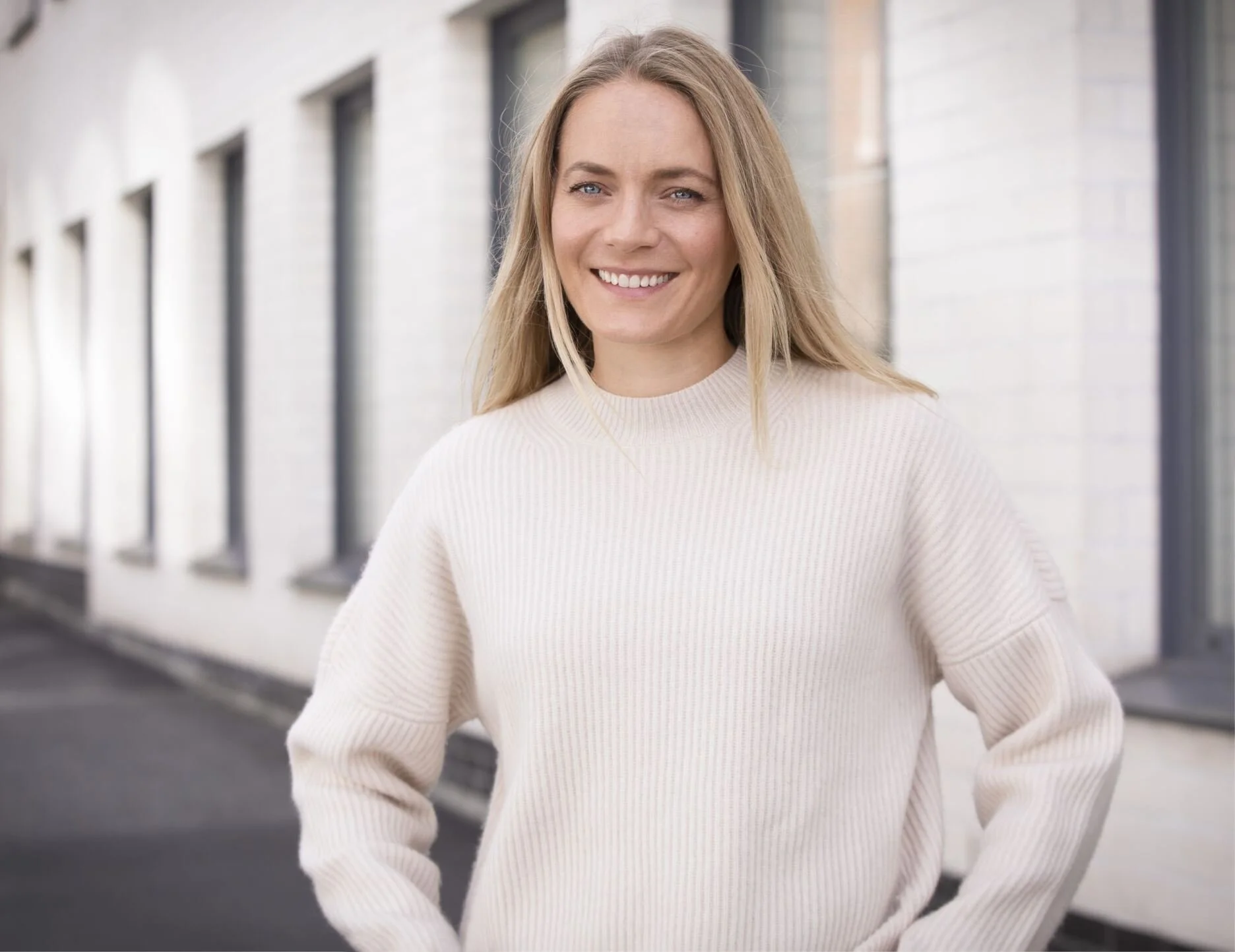
— Silje Vagli, Psychologist & Owner of Siljevagli.no